
Assessing the Competitiveness of Web3 Sectors: Insights into Capital Concentration
In this post we look at the distribution of capital within different sectors of web3 protocols; E.g. dexes, bridges, lending, derivatives, etc.
To gauge the competitiveness of these sectors, we turn to a trusted tool from the world of economics: the Herfindahl-Hirschman Index (HHI).
The Herfindahl-Hirschman Index: A Measure of Market Concentration HHI is a measure of the level of competition among firms in a market, or in our case, protocols within a sector. It provides a number between 0 and 10,000, with higher values indicating higher levels of capital concentration, hence less competition.
According to the Department of Justice (DOJ) antitrust guidelines, markets with an HHI between 1,500 and 2,500 points are considered moderately concentrated, while those exceeding 2,500 points are seen as highly concentrated.
Here’s a summary chart showing the HHI for each sector:
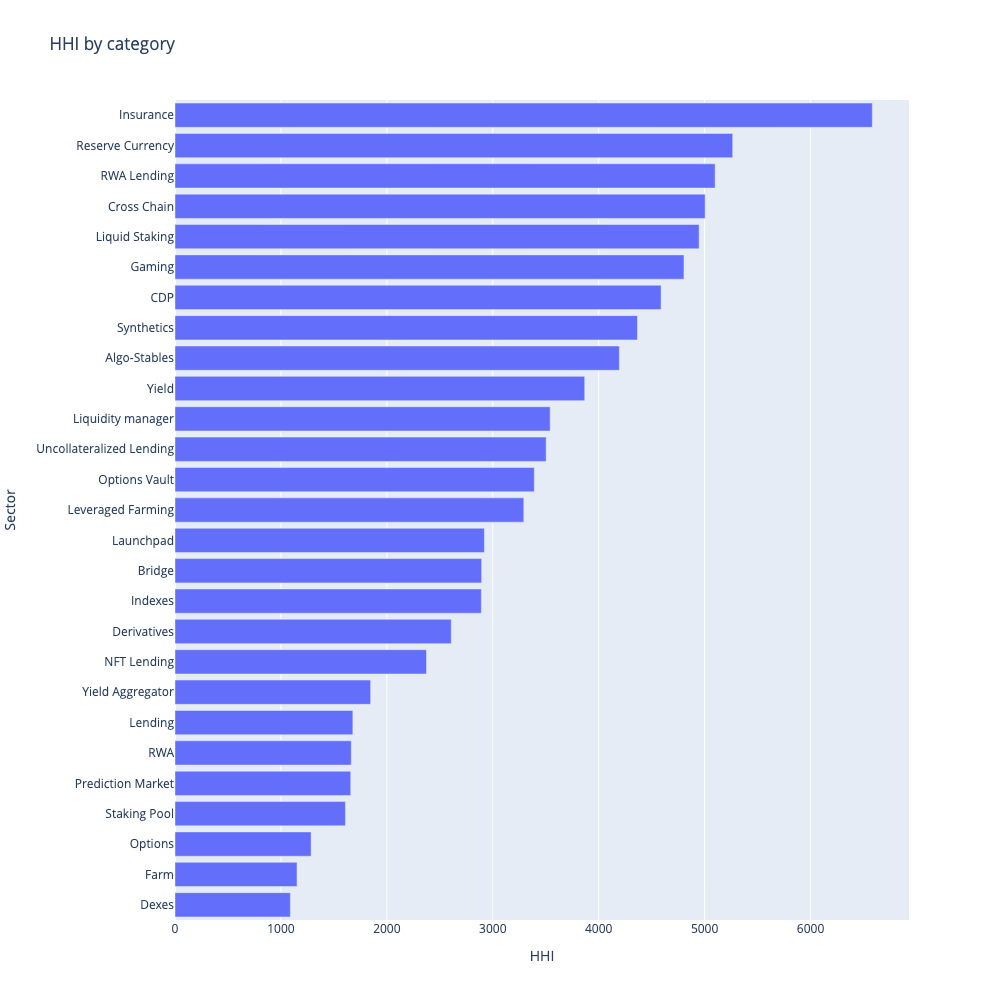
Most sectors are highly concentrated with a HHI > 2500, Insurance being the most highly concentrated with an HHI of 6685.
Dexes are the most competitive sector with over 300 different products competing for $15.5B of capital as we’ll see in the next section where we break down some of these sectors further.
Deeper Dive: Capital Distribution Within Sectors
Let’s take a look at the capital distribution in a few different sectors of Web3 protocols. We’ve created charts showing the distribution of Total Value Locked (TVL), a metric that indicates how much capital is tied up in a protocol.
Many web3 protocols are forks, derivatives of original protocols perhaps with slight modifications. For the purpose of this analysis, we aggregate them with their parent protocol to get a more accurate picture of “unique protocols.” It’s worth noting that these unique protocols can be considered the fundamental building blocks that shape the Web3 ecosystem.
In these charts, blue bars represent original protocols while orange bars denote forks. Furthermore, vertical lines have been included to show the 80%, 90%, and 95% thresholds for cumulative TVL. These thresholds help us understand how the capital is spread across various protocols.
Sectors are presented in order of their total TVL, from highest to lowest.
Liquid Staking

- 🔥 Highly concentrated market [HHI: 5016.0]
- 82 total protocols
- $20.14B Total TVL
- 0.45% of TVL is in forks
CDP

- 🔥 Highly concentrated market [HHI: 4671.0]
- 65 total protocols
- $9.39B Total TVL
- 1.21% of TVL is in forks
Bridges

- 🔥 Highly concentrated market [HHI: 2990.0]
- 39 total protocols
- $11.37B Total TVL
- 0.0% of TVL is in forks
Dexes

- 🟠 Moderately concentrated market [HHI: 1729.0]
- 319 total protocols
- $15.55B Total TVL
- 24.03% of TVL is in forks
Lending

- 🟠 Moderately concentrated market [HHI: 2027.0]
- 135 total protocols
- $14.19B Total TVL
- 9.12% of TVL is in forks
Yield

- 🔥 Highly concentrated market [HHI: 3938.0]
- 324 total protocols
- $4.94B Total TVL
- 0.98% of TVL is in forks
Derivatives

- 🔥 Highly concentrated market [HHI: 2869.0]
- 81 total protocols
- $1.43B Total TVL
- 2.76% of TVL is in forks
Yield Aggregator

- 🟠 Moderately concentrated market [HHI: 1968.0]
- 61 total protocols
- $1.23B Total TVL
- 1.08% of TVL is in forks
Synthetics

- 🔥 Highly concentrated market [HHI: 4485.0]
- 26 total protocols
- $611.73M Total TVL
- 0.16% of TVL is in forks
Insurance

- 🔥 Highly concentrated market [HHI: 6602.0]
- 20 total protocols
- $335.20M Total TVL
- 0.0% of TVL is in forks
Options

- 🟢 Unconcentrated market [HHI: 1286.0]
- 36 total protocols
- $120.72M Total TVL
- 0.0% of TVL is in forks
Options Vault

- 🔥 Highly concentrated market [HHI: 3432.0]
- 13 total protocols
- $46.59M Total TVL
- 0.38% of TVL is in forks
Data quality notes
This is quick and rough analysis designed to facilitate discussion for one of our portfolio companies - please don’t treat it as gospel.
It’s very likely that there is data missing (for example where is Kwenta?) or that some protocols have been misclassified.
The original source of the data is DefiLlama’s API: /protocols endpoint. Big thanks to the Llamas for their hard work and continual shipping.
I’ve published my Jupyter notebook on Github so you can see the full processing and analysis of the data, please take this work and extend it.
Future work should look at the change in capital concentration over time - I’d love to see that but don’ t have time to do it myself right now. Please share if you do!